

Double Range Slider Using HTML, CSS & JavaScript
Hi to all of you! Welcome to the cssiseasy tutorial for today. We will learn how to use HTML, CSS, and JavaScript to create a double range slider. The main goal of this project is to give customers of an online shopping platform a financial constraint.

We may better organize our project by using HTML (Hypertext Markup Language), which lists the necessary components and features needed to make the double range slider.
The project will then be styled or designed using CSS (Cascading Style Sheets) with the proper padding and alignment for the double range slider.
Lastly, we will add functionality to the double range slider project using JavaScript so that it can be manipulated by the user.
I’m assuming that you understand everything about the project.
HTML Code for Double Range Slider -
<html lang="en">
<head>
<meta name="viewport" content="width=device-width, initial-scale=1.0">
<title>Double Range Slider</title>
<!--Google Fonts-->
<link href="https://fonts.googleapis.com/css2?family=Poppins:wght@500&display=swap" rel="stylesheet">
<!--Stylesheet-->
<link rel="stylesheet" href="style.css">
</head>
<body>
<div class="wrapper">
<div class="values">
<span id="range1">
0
</span>
<span> ‐ </span>
<span id="range2">
100
</span>
</div>
<div class="container">
<div class="slider-track"></div>
<input type="range" min="0" max="100" value="30" id="slider-1" oninput="slideOne()">
<input type="range" min="0" max="100" value="70" id="slider-2" oninput="slideTwo()">
</div>
</div>
<!--Script-->
<script src="script.js"></script>
</body>
</html>
Let’s begin by building the double range slider project’s framework. The code above shows how we’ll organize it using every necessary element and features. For our range slider, we’ll use div tags to construct a wrapper class, class names with div tags to set the value to 0, &dash tags to add a dash symbol, and another div tag to add the next number.
Using the input type range, we will now create two range sliders. For these range sliders, the minimum and maximum widths are already known.
In order to apply styles and reorganize tags, let’s code the CSS portion.
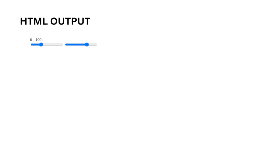
HTML Code Output -
CSS Code for Double Range Slider -
					*,
*:before,
*:after{
    padding: 0;
    margin: 0;
    box-sizing: border-box;
    font-family: "Poppins",sans-serif;
}
body{
    height: 100vh;
    display: -ms-grid;
    display: grid;
    background-color: #3264fe;
    place-items: center;
}
.wrapper{
    position: relative;
    width: 95vmin;
    background-color: #ffffff;
    padding: 50px 40px 20px 40px;
    border-radius: 10px;
}
.container{
    position: relative;
    width: 100%;
    height: 100px;
    margin-top: 30px;
}
input[type="range"]{
    -webkit-appearance: none;
    -moz-appearance: none;
    appearance: none;
    width: 100%;
    outline: none;
    position: absolute;
    margin: auto;
    top: 0;
    bottom: 0;
    background-color: transparent;
    pointer-events: none;
}
.slider-track{
    width: 100%;
    height: 5px;
    position: absolute;
    margin: auto;
    top: 0;
    bottom: 0;
    border-radius: 5px;
}
input[type="range"]::-webkit-slider-runnable-track{
    -webkit-appearance: none;
    height: 5px;
}
input[type="range"]::-moz-range-track{
    -moz-appearance: none;
    height: 5px;
}
input[type="range"]::-ms-track{
    appearance: none;
    height: 5px;
}
input[type="range"]::-webkit-slider-thumb{
    -webkit-appearance: none;
    height: 1.7em;
    width: 1.7em;
    background-color: #3264fe;
    cursor: pointer;
    margin-top: -9px;
    pointer-events: auto;
    border-radius: 50%;
}
input[type="range"]::-moz-range-thumb{
    -webkit-appearance: none;
    height: 1.7em;
    width: 1.7em;
    cursor: pointer;
    border-radius: 50%;
    background-color: #3264fe;
    pointer-events: auto;
}
input[type="range"]::-ms-thumb{
    appearance: none;
    height: 1.7em;
    width: 1.7em;
    cursor: pointer;
    border-radius: 50%;
    background-color: #3264fe;
    pointer-events: auto;
}
input[type="range"]:active::-webkit-slider-thumb{
    background-color: #ffffff;
    border: 3px solid #3264fe;
}
.values{
    background-color: #3264fe;
    width: 32%;
    position: relative;
    margin: auto;
    padding: 10px 0;
    border-radius: 5px;
    text-align: center;
    font-weight: 500;
    font-size: 25px;
    color: #ffffff;
}
.values:before{
    content: "";
    position: absolute;
    height: 0;
    width: 0;
    border-top: 15px solid #3264fe;
    border-left: 15px solid transparent;
    border-right: 15px solid transparent;
    margin: auto;
    bottom: -14px;
    left: 0;
    right: 0;
}
Second, the CSS code appears. Here, we’ve reorganized and stylized the double range slider project’s structure to guarantee correct alignment and no issues with the relevant CSS elements.
Step1: We’ll change the box-sizing property to “border-box,” the font-family property to “Poppins,” and the padding and margin to zero using the universal selector.
We’ll set the height to “100vh,” the display property to “grid,” and utilize the justify-items property to center items on the page now that we’ve chosen the body tag.
					*,
*:before,
*:after{
    padding: 0;
    margin: 0;
    box-sizing: border-box;
    font-family: "Poppins",sans-serif;
}
body{
    height: 100vh;
    display: -ms-grid;
    display: grid;
    background-color: #3264fe;
    place-items: center;
}
Step 2: By utilizing the class selector (.wrapper), we’ll set the position to “relative,” the width to 95vmin, and the border to “10px.”
Now let’s add styles to our range sliders using the input tag selector. We will set the position of our range sliders to “absolute” and the background-color define to “transparent,” and we will set the width of our range sliders to 100%.
					input[type="range"]::-webkit-slider-runnable-track{
    -webkit-appearance: none;
    height: 5px;
}
input[type="range"]::-moz-range-track{
    -moz-appearance: none;
    height: 5px;
}
input[type="range"]::-ms-track{
    appearance: none;
    height: 5px;
}
input[type="range"]::-webkit-slider-thumb{
    -webkit-appearance: none;
    height: 1.7em;
    width: 1.7em;
    background-color: #3264fe;
    cursor: pointer;
    margin-top: -9px;
    pointer-events: auto;
    border-radius: 50%;
}
input[type="range"]::-moz-range-thumb{
    -webkit-appearance: none;
    height: 1.7em;
    width: 1.7em;
    cursor: pointer;
    border-radius: 50%;
    background-color: #3264fe;
    pointer-events: auto;
}
input[type="range"]::-ms-thumb{
    appearance: none;
    height: 1.7em;
    width: 1.7em;
    cursor: pointer;
    border-radius: 50%;
    background-color: #3264fe;
    pointer-events: auto;
}
input[type="range"]:active::-webkit-slider-thumb{
    background-color: #ffffff;
    border: 3px solid #3264fe;
}
Step 3: Now that the value has styles added to it, we will use the class selector (.value) to set the font’s boldness, position to “absolute,” width to 32%, and background color to blue. There should be a 5px border. The text-align define is used to center the content.
					.values:before{
    content: "";
    position: absolute;
    height: 0;
    width: 0;
    border-top: 15px solid #3264fe;
    border-left: 15px solid transparent;
    border-right: 15px solid transparent;
    margin: auto;
    bottom: -14px;
    left: 0;
    right: 0;
}
CSS Code Output -
To make it responsive, let’s now code the JavaScript section.
JavaScript Code for Double Range Slider -
					window.onload = function(){
    slideOne();
    slideTwo();
}

let sliderOne = document.getElementById("slider-1");
let sliderTwo = document.getElementById("slider-2");
let displayValOne = document.getElementById("range1");
let displayValTwo = document.getElementById("range2");
let minGap = 0;
let sliderTrack = document.querySelector(".slider-track");
let sliderMaxValue = document.getElementById("slider-1").max;

function slideOne(){
    if(parseInt(sliderTwo.value) - parseInt(sliderOne.value) <= minGap){
        sliderOne.value = parseInt(sliderTwo.value) - minGap;
    }
    displayValOne.textContent = sliderOne.value;
    fillColor();
}
function slideTwo(){
    if(parseInt(sliderTwo.value) - parseInt(sliderOne.value) <= minGap){
        sliderTwo.value = parseInt(sliderOne.value) + minGap;
    }
    displayValTwo.textContent = sliderTwo.value;
    fillColor();
}
function fillColor(){
    percent1 = (sliderOne.value / sliderMaxValue) * 100;
    percent2 = (sliderTwo.value / sliderMaxValue) * 100;
    sliderTrack.style.background = `linear-gradient(to right, #dadae5 ${percent1}% , #3264fe ${percent1}% , #3264fe ${percent2}%, #dadae5 ${percent2}%)`;
}
We will now add two more functions, slideOn() and slideTo(), inside the function. Now, we’ll use document.querySelector to select each HTML element. Next, we’ll use the slideOn() method and an if condition to convert the slider value to an integer and decrease it by two. We will also color the inside of our slider.
Similar to that, we’ll write the slideTo() function and utilize the if condition to decrement by one in order to adjust the values of the sliders.
JavaScript is where we added logic and coded in accordance with the specifications, with some conditions, in the project’s last step. Let’s look at the finished result of the HTML, CSS, and JavaScript double range slider project.
Final Output -
See the Pen Range Slider by Harsh Sawant (@harshh9) on CodePen.
We have successfully used HTML, CSS, and JavaScript to create our double range slider. The appropriate lines of code are included with the code pen link above, so feel free to utilize this project for your own purposes.
If you find this blog useful, be sure to follow the front-end project Instagram page and run a Google search for cssiseasy with source code.
A Range Slider: What Is It?
To designate a numerical value that should not be less than or more than another, range sliders are used. Put differently, it lets you choose a number from a range that is shown as a slider. They come particularly handy when adjusting computer interface settings including brightness, volume, and picture filters.
How Do Range Sliders Work?
Range sliders are mostly seen on e-commerce websites, although they can also be found in computer brightness and volume controls, which give users a crucial visual representation of the range slider.
